KEENEVISIONS / BRANDING & WEB DESIGN

Four businesses.
Four new directions.

Explore four before-and-after brand and website concepts, each tailored to a different business and audience.

01 / Brewed Awakenings
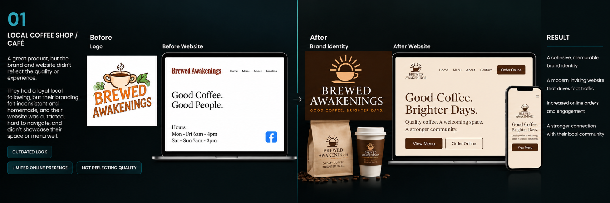
Brewed Awakenings illustrative before and after brand identity and website design concept

Audience: An established neighborhood café with a warm, local following

Challenge: Create a cohesive, welcoming identity that is easy to recognize

Creative direction: A sunrise coffee symbol and consistent brown-and-cream design across packaging and a simple ordering website

Intended benefit: Make the experience easier to understand and remember
Concept work for demonstration purposes. The “before” and “after” visuals are fictional examples; results described are proposed benefits, not measured outcomes.

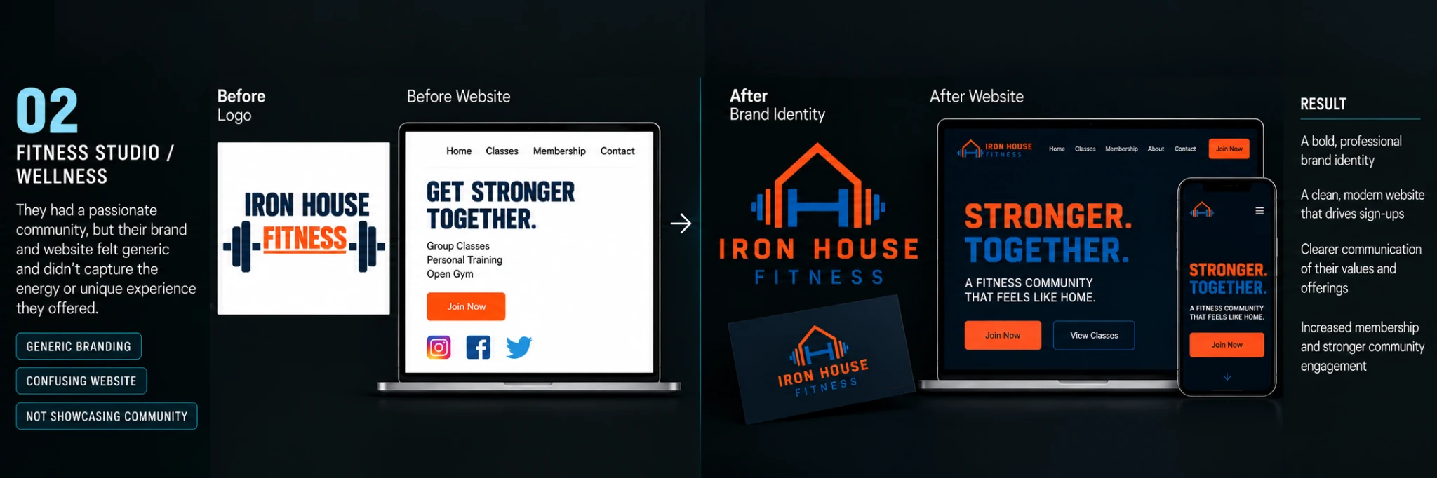
02 / Iron House Fitness

Iron House Fitness illustrative before and after brand identity and website design concept

Audience: A community-oriented gym serving everyday members

Challenge: Give a familiar fitness business a more distinctive, structured presence

Creative direction: House and barbell forms connect the gym name to a clear orange-and-blue identity

Intended benefit: Make class information and membership inquiries easier to find

Concept work for demonstration purposes. The “before” and “after” visuals are fictional examples; results described are proposed benefits, not measured outcomes.

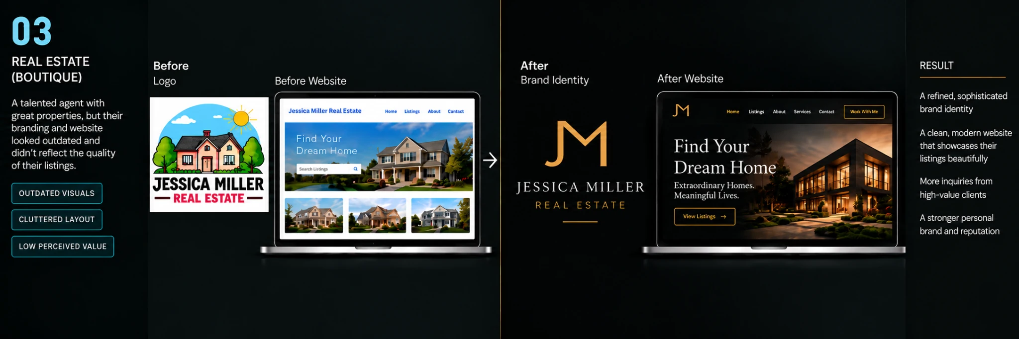
03 / Jessica Miller Real Estate

Jessica Miller Real Estate illustrative before and after brand identity and website design concept

Audience: A boutique real estate professional serving homebuyers and sellers

Challenge: Present a more refined, confident personal brand

Creative direction: A restrained JM monogram and consistent black-and-gold styling frame the property imagery

Intended benefit: Help prospective clients understand the service and explore listings

Concept work for demonstration purposes. The “before” and “after” visuals are fictional examples; results described are proposed benefits, not measured outcomes.

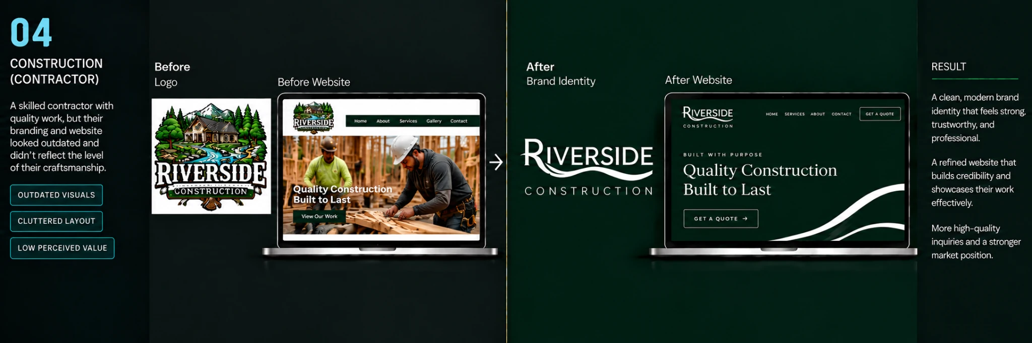
04 / Riverside Construction

Riverside Construction illustrative before and after brand identity and website design concept

Audience: A construction contractor seeking higher-trust presentation

Challenge: Communicate craftsmanship and dependability with less visual clutter

Creative direction: A custom Riverside wordmark and river motif unify a dark-green-and-white system

Intended benefit: Make the work and quote request more prominent

Concept work for demonstration purposes. The “before” and “after” visuals are fictional examples; results described are proposed benefits, not measured outcomes.